

Dick Blick UX | UI Web Site
Dick Blick Overview- Conceptual e commerce pop up web site
Dick Blick the Major Art Supply Store is looking to create a responsive pop up e commerce store for Back to School with the hope of driving sales and revenue as well as capture and expand their customer base.
3 Personas were given to us. Dexter is a 20 year old art student at Parsons, John is a 38 year old art teacher at an elementary school and Edda is a 47 year old HR manager and mother of a 14 and 16 year old.
As a UX/UI Designer who was given these clear paradigms that would inform my design process and enable me to deliver a responsive MVP, I knew I would set myself up for success if I begin and followed through by identifying and solving the following:
● Business Goals
An opportunity to communicate online with customers and create a deeper connection
Capitalizing on strategic means to clear out stock, excess inventory and promotion of new products.
● Design Goals
Understand and Structure Information Architecture
Create Comparative User Flows and Site map to begin the design of wireframes
Heuristic Review
● User Goals
Visit given research to gain insights and establish primary user focus:
NEEDS: Knowledge on products and fast shipping
PAIN POINTS: Sites that don’t work on tablet and ones that are dysfunctional and visually poor, lengthy checkout process
DELIVERABLES:
Report including research findings over and above given personas, user flow map, competitor user flow maps, site map, clickable prototype of one of the 3 responsive states best suited persona requirement. High fidelity annotated wireframes of Mobile, Tablet and Web responsive screens.
Tablet screens
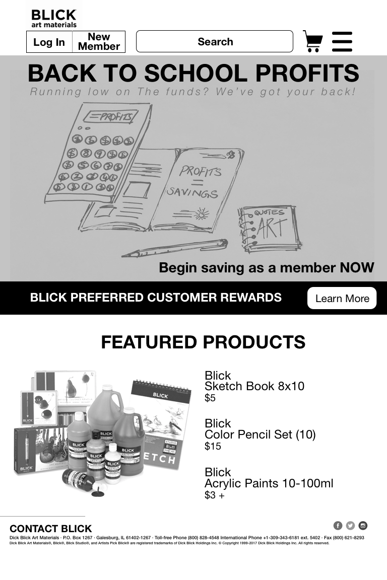
Landing Page
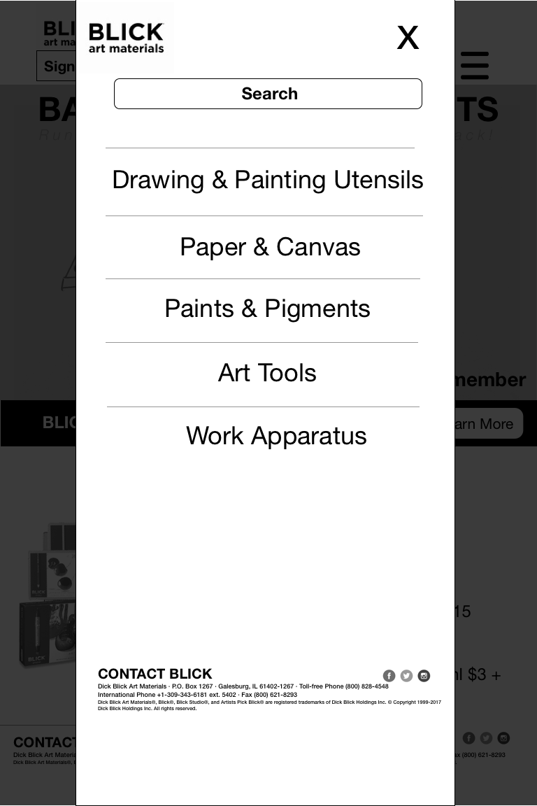
Hamburger Menu
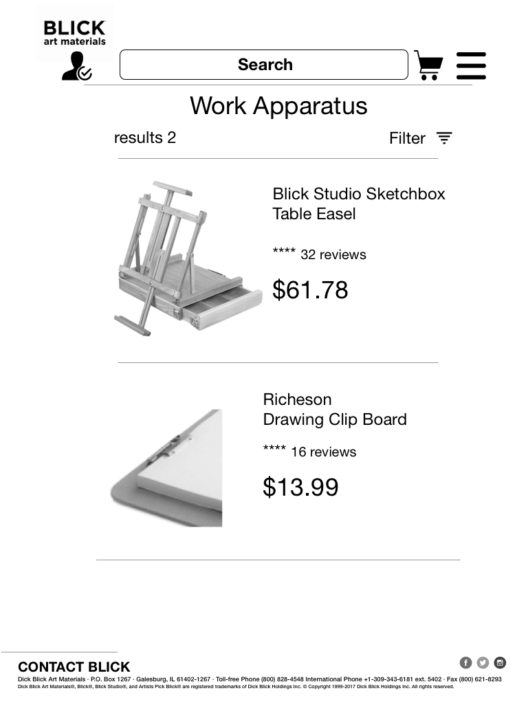
Product Search Result
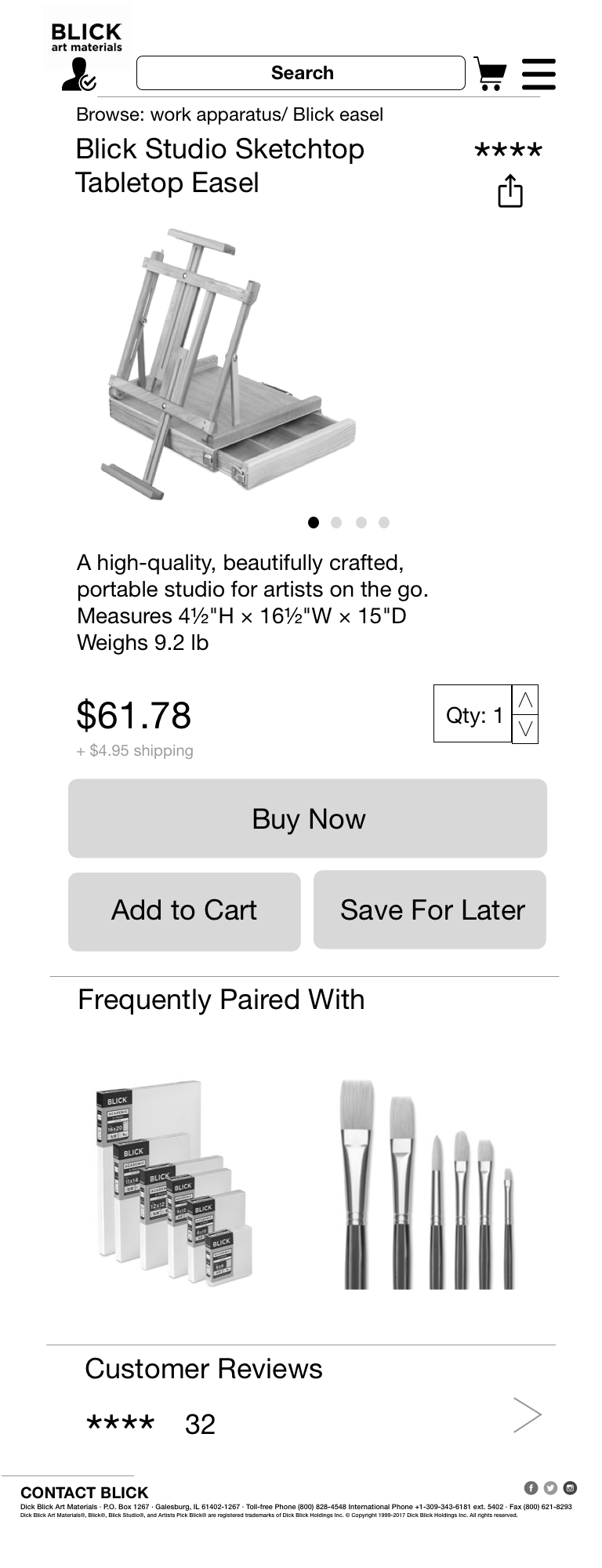
Product Description Page
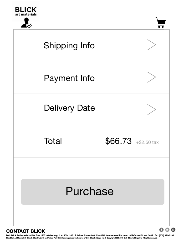
Member Checkout
Information Architecture
Open and Closed card sorting research methodology adopted to inform the IA for the 100 item inventory used towards this project This best practice adopted allowed me to create appropriate taxonomies and nomenclature that would inform my site map.
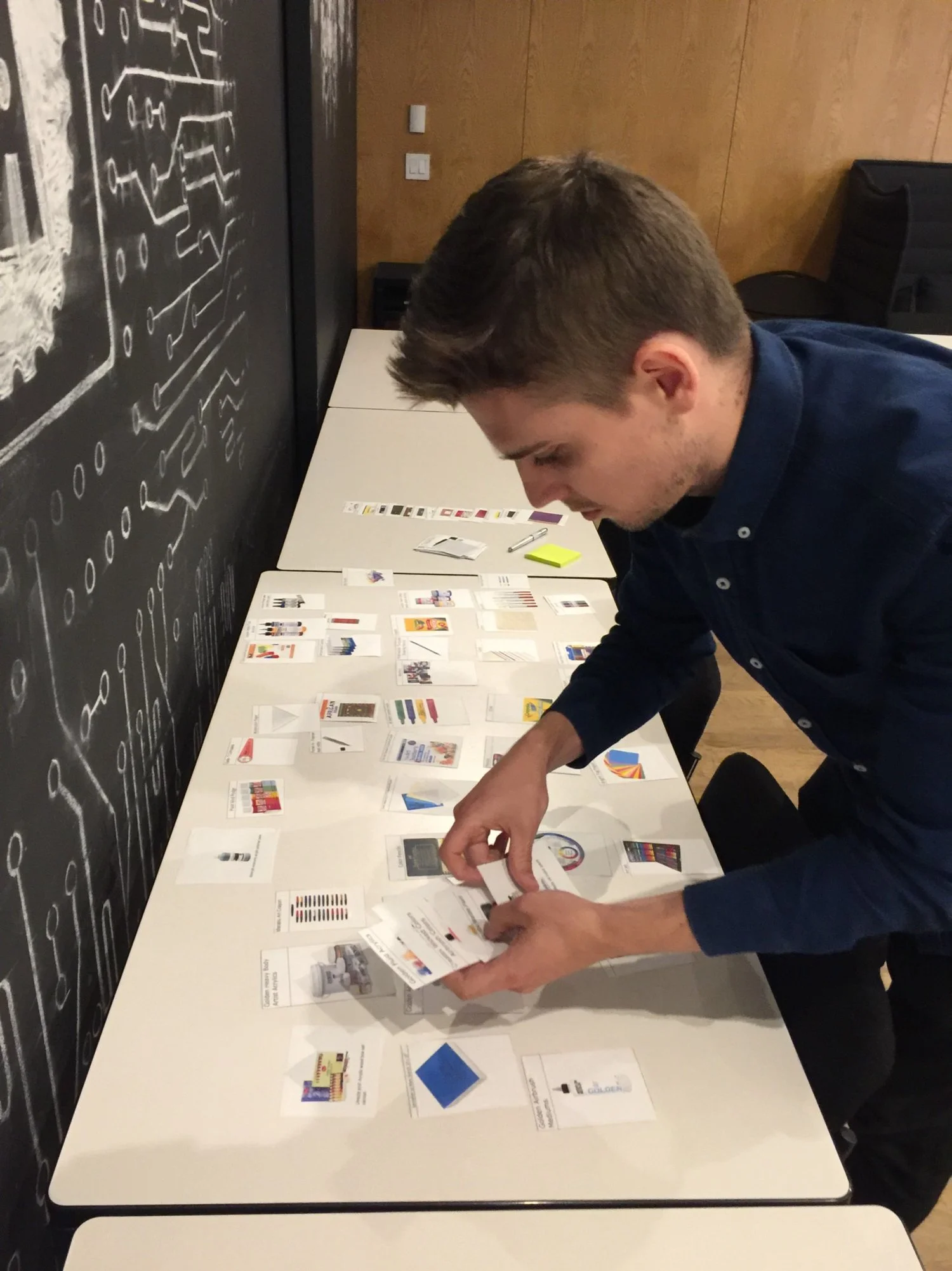
Open Card Sort
One of the users did not know much about art and so was not able to sort through the items and understand what they were as most were specialized art supplies. The take away was that it is very important to screen users as per the persona requirements I was working with.
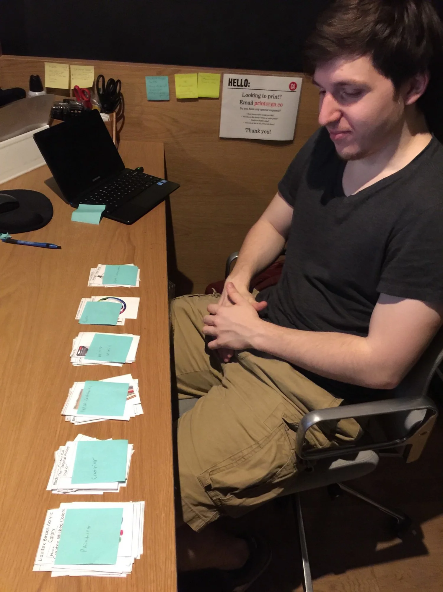
Closed Card Sort
Iterations upon my closed card topics: first round of closed sorting from 2 user testers I had screened, they had advanced knowledge of art supplies. Second round included users who were general shoppers. Takeaway: ensured that the labels created were universally recognizable.
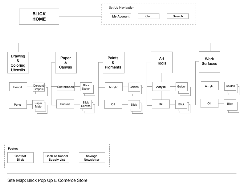
Site Map
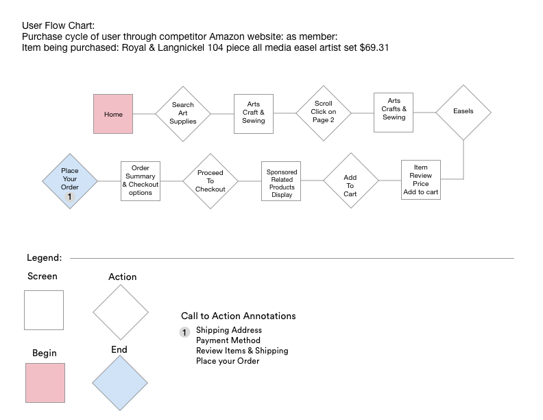
Competitor User Flow Chart
Competitor User Flow Chart shown here- Amazon:The research that went into designing the user flows was more on a feature comparison. Helped me to understand what’s out there and what worked and what didn’t. I based my findings on Amazon, Michaels and Utrecht.
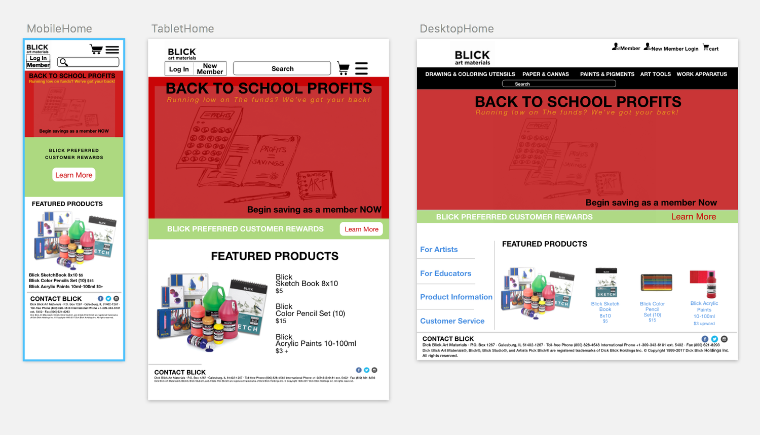
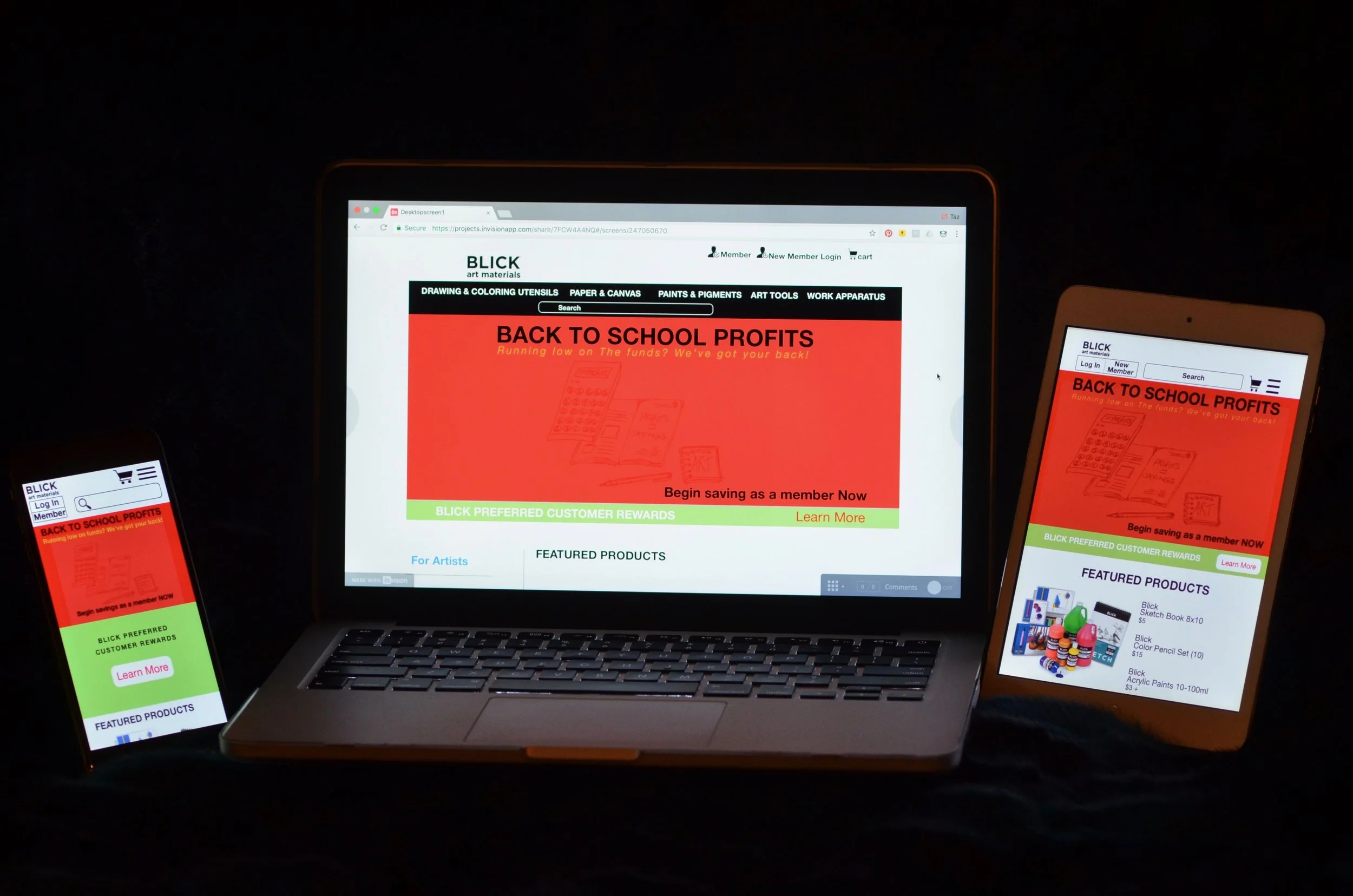
Hi Fidelity Wireframes of Landing Page Responsive State
Mobile/ Tablet / Desktop
Next Steps
Enhance the Desirability and Accessibility Heuristic
Key is to make interface simple to navigate but also keep in mind that people with learning disabilities are highly artistic and use art supplies as therapy and expression. They make up a big part of the users as well.
Work on creating more user friendly taxonomy labels with current Blick products. Look into SEARCH tool as an alternative to complex taxonomy labels